Gdoc/Admin

Popular pages

Research and data to make progress against the world’s largest problems.

Read about our mission

We are a non-profit — all our work is free to use and open source.

Donate to support us

Data Insights

Bite-sized insights on how the world is changing, published every few days.

See all Data Insights
A bar chart displays the percentage of respondents from various countries who believe their lives will improve in the next five years, measured on the "Cantril Ladder." The highest percentage comes from Brazil at 92%, followed by Nigeria and Indonesia at 88%. The United States reports 87%, while Argentina, Mexico, and the Philippines each have 85%. Australia is at 84%, Sweden at 83%, and South Africa at 82%. Spain and the UK both show 82% and 80%, respectively. Japan registers 79%, India at 77%, Germany at 75%, and Egypt at the lowest with 73%. The chart has color-coded bars, with a darker shade indicating the percentage of those who believe life will improve and lighter shades indicating those who think it will stay the same or get worse. The data source is the Global Flourishing Study (2024), with information collected in 2023. The chart is licensed under CC BY.

Most people are fairly optimistic that their lives will improve

If you ask people about whether the world as a whole is getting better or worse, most people say the latter. People are generally pessimistic about global or societal progress.

But they are typically much more optimistic about improvements in their own lives.

In the chart, you can see what share of people think they would be higher or lower on the “Cantril Ladder” five years in the future. The “Cantril Ladder” asks people to rate their lives on a scale from 0 (the worst possible life) to 10 (the best). Here, respondents were asked to rate where they are now, and where they think they’d be in five years.

As you can see, most people say they will be higher on the ladder across a wide range of countries. They expect their lives to improve.

Of course, this is not true of everyone, everywhere, but these results tend to support the argument that people are generally “individually optimistic, but societally pessimistic”.

Explore more data on happiness and life satisfaction across the world

Continue reading
The image presents a line graph showing life expectancy from 1974 to 2024 across different regions. The vertical axis represents life expectancy in years, while the horizontal axis indicates the years from 1974 to 2024. 

Six regions are depicted, each represented by a differently colored line: 

- North America starts at 72 years (1974) and rises to 80 years (2024).
- Europe begins at 71 years and increases to 79 years.
- Oceania starts at 68 years and also increases, reaching 79 years.
- Latin America begins at 61 years and goes up to 76 years.
- Asia starts at 56 years and climbs to 75 years.
- Africa shows the lowest life expectancy, starting at 46 years, but increases to 64 years by 2024.

The graph includes a title at the top stating "Life expectancy, 1974 to 2024" and provides a brief description of what period life expectancy means. At the bottom, the data source is cited as "UN, World Population Prospects (2024)." The overall design is clean, with clearly labeled axes and color differentiation for easy reference.

Life expectancy in Africa is lower than on other continents

Where you are born and stay for much of your life is a strong predictor of how long you’re likely to live. The chart shows the differences in period life expectancy across continents.

Average life expectancy has converged to a fairly narrow band between 75 and 80 years in North America, Oceania, Europe, Latin America, and Asia. Africa stands out: its average life expectancy is 64 years, over a decade lower than any other region.

This gap reflects several overlapping factors: high rates of child and maternal deaths, a heavy burden of infectious diseases such as malaria, HIV/AIDS, and tuberculosis, limited access to quality healthcare and infrastructure, and high levels of poverty.

Despite this, life expectancy in Africa has risen by almost two decades since 1974.

Explore life expectancy for individual countries

Continue reading
The image depicts a line chart illustrating child mortality rates, specifically the estimated percentage of newborns who do not survive past the age of five. The chart has two distinct lines: one representing Sweden in blue and the other representing South Korea in red. 

Starting in the early 1800s, the blue line for Sweden shows a gradual decline in the child mortality rate, fluctuating around 35% at the beginning and continuing to decrease steadily over the years, reaching nearly 0% by 2023. 

In contrast, the red line for South Korea begins more steeply in the mid-20th century, experiencing a rapid decline after 1950, ultimately approaching a very low percentage by 2023. 

The title at the top reads "Child mortality rate," and below it, descriptive text clarifies that the data reflects the estimated share of newborns who die before reaching five years old. The sources for the data are listed at the bottom as Gapminder (2015) and the UN Inter-agency Group for Child Mortality Estimation (2025). The entire chart is labeled as CC BY for Creative Commons licensing.

Declining child mortality, fast and slow

As this chart shows, two centuries ago, about one in three children in Sweden died before they were five years old.

Since then, the child mortality rate in Sweden has declined to 0.3%.

South Korea achieved a similar reduction much faster. This is often the case: the first countries to improve living conditions usually needed much longer than some of those countries catching up later — the latter can learn from what worked elsewhere.

Explore this data for every other country in the world
Continue reading
The image presents a bar graph illustrating the smoking rates among adults aged 15 years and older across various countries in Western Europe for the year 2022. The bar heights represent the percentage of adults who used any form of tobacco, excluding e-cigarettes. 

France has the highest smoking rate at 35%, followed closely by Greece at 33%. Spain follows with 28%, then Belgium at 27%, and Portugal, Switzerland, and Austria, all at 26%. Sweden reports a rate of 23%, while both Italy and Finland have rates of 22%. The Netherlands and Germany each have a smoking rate of 21%. Ireland reports 19%, Denmark at 16%, and the UK and Norway both have the lowest rates at 14%. 

Additionally, a note indicates that the smoking rates in France and Greece are more than twice as high as those in Denmark, the UK, or Norway. 

The data source is the World Health Organization, specifically the Global Health Observatory, and the information is labeled as "CC BY," indicating it is licensed for reuse.

Smoking rates vary a lot across Western Europe

As someone born and living in the United Kingdom, one thing I notice when visiting other countries in Western Europe is how much more common smoking is elsewhere.

This is not just my imagination; this anecdotal evidence is backed up by the data on smoking rates.

In the chart, you can see the share of adults who say they currently use tobacco products (mostly cigarettes, but chewing tobacco is also included) across a range of countries in Western Europe.

The differences are large. In France and Greece, around one-third of adults use tobacco, more than twice the rate in countries like Denmark, the UK, and Norway.

Given that smoking is one of the leading risk factors for disease burden and premature death, these differences matter a lot for public health.

Explore how smoking rates compare in other parts of the world

Continue reading
A bar chart illustrates access to clean cooking fuels in various Asian countries in 2023. The title highlights that Bangladesh significantly lags behind its neighbors. Each bar represents the share of the population with access to clean cooking fuels, including natural gas, electricity, and clean cookstoves. 

China has the highest percentage at 89%, followed by Thailand at 87%, and India at 77%. Pakistan shows 55%, while Myanmar has 54%, and Nepal has 43%. Afghanistan's percentage is 39%, Sri Lanka is at 35%, and Bangladesh is notably the lowest at 28%, marked in a darker color for emphasis. 

A note explains that the reliance on non-clean cooking fuels, such as biomass, can lead to pollution harmful to health. The data source is the World Health Organization and the Global Health Observatory, with a reference year of 2025.

Access to clean cooking fuels in Bangladesh is far lower than in its Asian neighbors

Electricity access in Bangladesh has transformed over my lifetime: from around 15% of the population 30 years ago, to 99% today.

But progress on clean cooking fuels has lagged far behind. Fewer than 30% of households cook with gas, electricity, or improved stoves; most still rely on wood, crop waste, or straw. The chart shows that clean fuel usage is well below the levels reached by its Asian neighbors.

The costs are huge. Using biomass for cooking damages forests and harms health because people breathe in smoke and particulates. In Bangladesh, deaths from indoor air pollution are higher than the average in low-income countries, even though those countries usually have worse overall health. Indoor air pollution is close to being the country’s largest risk factor for early death.

Why has progress been so slow? The main barrier is economic. Bangladesh produces very little liquefied petroleum gas (LPG), relying instead on volatile imports. Its lack of domestic distribution networks also pushes prices, making clean cooking fuels expensive for consumers. Some of Bangladesh’s neighbors — like India — have given subsidies to help households switch; Bangladesh has not, making clean cooking fuels less affordable.

Cultural factors also matter. Biomass is often seen as “free” and convenient, and families are used to traditional cookstoves and the flavors they generate. They might be unaware of how damaging this pollution is to their health and skeptical of the damage that alternatives such as LPG could do.

Read my colleague Max Roser’s article — “The world’s energy problem” — for a global perspective on this issue

Continue reading
The image displays a line graph illustrating the growth of nuclear electricity generation in France from 1970 to 2024, measured in terawatt-hours (TWh). The vertical axis, ranging from 0 to 500 TWh, indicates the amount of electricity generated, while the horizontal axis represents the years. 

Starting from near zero in 1970, the curve rises steeply, particularly in the 1980s, reflecting the rapid expansion of nuclear power. Key annotations highlight that the first commercial reactor was opened in 1964, and by 1980, nuclear generation was at 60 TWh. By 1990, this figure exceeded 300 TWh. 

The graph shows a general upward trend until 1999, with no new plants added until the anticipated opening of the Flamanville plant in 2024. After peaking, the curve indicates a decline in generation towards the end of the period shown. 

The bottom of the graph provides its data source, citing the Energy Institute and the Statistical Review of World Energy, published in 2025. The image is credited under the Creative Commons BY license.

France opened a flurry of nuclear power plants in the 1980s and 1990s, giving it low-carbon electricity ever since

At the turn of the millennium, France had one of the lowest-carbon electricity grids in Europe (and the world). While countries like the UK and Germany emitted well over 500 grams of CO₂ per kilowatt-hour of electricity, France emitted just 80 grams — six times less. This was mostly thanks to nuclear power.

In the 1980s and 1990s, France rapidly expanded its power grid, and almost all of this growth came from new nuclear plants. The chart shows this: in the 1980s alone, nuclear power grew from 60 to over 300 terawatt-hours.

By 2000, nuclear power supplied almost 80% of the country’s electricity, making it much cleaner than its neighbors, mostly relying on coal and gas.

France still has one of the cleanest grids in Europe, although it has added very little nuclear power in the 21st century. It has opened just one plant in the last 25 years, in Flamanville, following long delays and cost overruns.

In the last decade, solar and wind power have grown the most.

See what countries produce nuclear energy, and how their generation has changed over time

Continue reading
A line graph titled "There are just two Northern White rhinos left in the world; both are female" outlines the decline in the estimated population of Northern White rhinos from 1960 to 2021. The vertical axis represents the estimated number of rhinos, ranging from zero to 2,500, while the horizontal axis spans the years from 1960 to 2021.

In 1960, the estimated population was approximately 2,230 rhinos. The line sharply declines, indicating a significant drop, with the population reaching about 350 rhinos by 1981. The downward trend continues, with a note indicating that by 2018, only two females named Najin and Fatu remain, following the death of the last male, Sudan.

Data sources are listed at the bottom as African and Asian Rhino Specialist Groups (AfRSG), with a Creative Commons attribution notation (CC BY).

Only two Northern White rhinos remain, and both are female

The Northern White rhino is on the brink of extinction. In the chart, you can see the collapse of this beautiful animal's population as a result of poaching, habitat loss, and conflict.

Now, only two individuals are left — Najin and her daughter, Fatu. Without males, the subspecies is “functionally extinct” and cannot rebuild its population naturally.

Scientists, though, offer some hope of bringing the rhino back through assisted reproduction. Eggs from Najin and Fatu have been fertilized with preserved sperm from dead male rhinos to produce viable embryos. Since neither Najin nor Fatu can carry a pregnancy, the plan is to use a female Southern White rhino — the closest subspecies — as a surrogate, to carry the embryo through to birth.

In 2023, a surrogate called Curra became pregnant, showing that the method works. Sadly, she died of a bacterial infection during pregnancy.

Scientists plan to try again and are also exploring other breakthrough reproduction treatments to save the Northern White rhino before it’s lost forever.

Read my article on why large mammals are so threatened with extinction

Continue reading

Explore our data

Featured data from our collection of 13,794 interactive charts.

See all our data

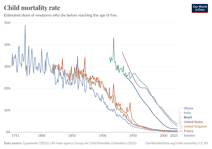
What share of children die before their fifth birthday?

What could be more tragic than the death of a young child? Child mortality, the death of children under the age of five, is still extremely common in our world today.

The historical data makes clear that it doesn’t have to be this way: it is possible for societies to protect their children and reduce child mortality to very low rates. For child mortality to reach low levels, many things have to go right at the same time: good healthcare, good nutrition, clean water and sanitation, maternal health, and high living standards. We can, therefore, think of child mortality as a proxy indicator of a country’s living conditions.

The chart shows our long-run data on child mortality, which allows you to see how child mortality has changed in countries around the world.

Explore the data
Explore the data

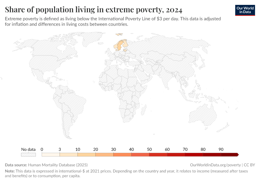
Share of population living in extreme povertyWorld Bank

Life expectancyLong-run estimates collated from multiple sources by Our World in Data

CO₂ emissions per capitaLong-run estimates from the Global Carbon Budget

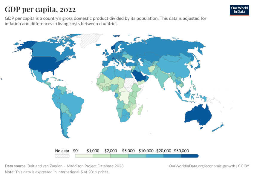
GDP per capitaLong-run estimates from the Maddison Project Database

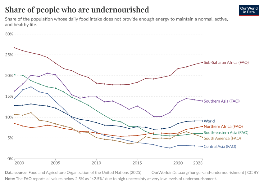
Share of people who are undernourishedUN FAO

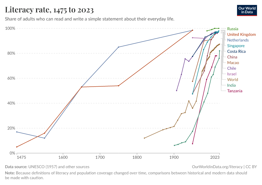
Literacy rateLong-run estimates collated from multiple sources by Our World in Data

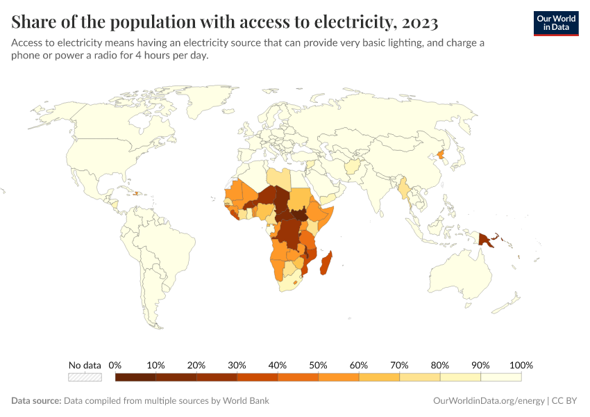
Share of the population with access to electricityWorld Bank

Data explorers

See all our Data Explorers

Interactive visualization tools to explore a wide range of related indicators.

All our topics

All our data, research, and writing — topic by topic.

Population and Demographic Change

Health

Energy and Environment

Food and Agriculture

Poverty and Economic Development

Education and Knowledge

Innovation and Technological Change

Living Conditions, Community and Wellbeing

Human Rights and Democracy

Violence and War